SYD ✈️ MEL. Was great to come visit #wpsyd last night, thanks for having me.
Archives: Notes
-
-
Opens news, reads about our political leaders. Crushes phone underfoot, burns it. A tear rolls down my cheek as I have a bleach shower.
-
I could take courses in seat selection!
?⭕️? -
MEL ✈️ SYD
-
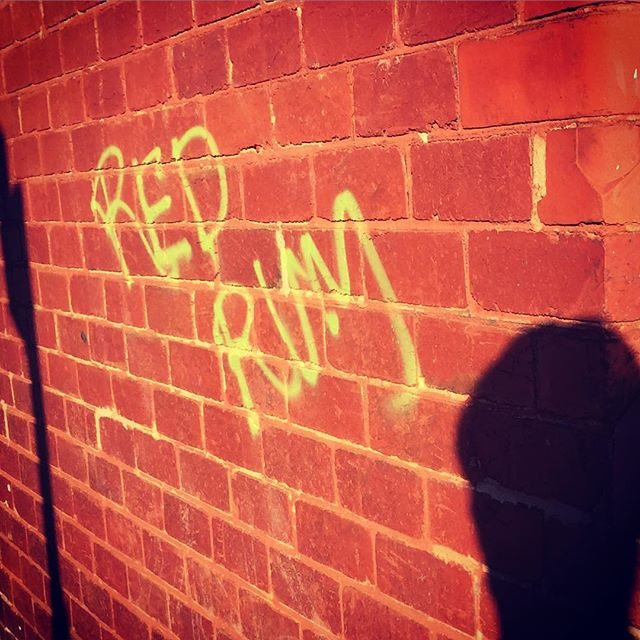
This appeared a few days ago. Rewatching the Shining.
-
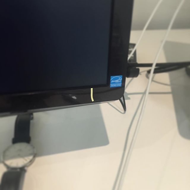
Post-it so I can see the power button. Hashtag design.
-
Last year I made this as a joke for #yolofriday.
output.jsbin.com/hasubi
-
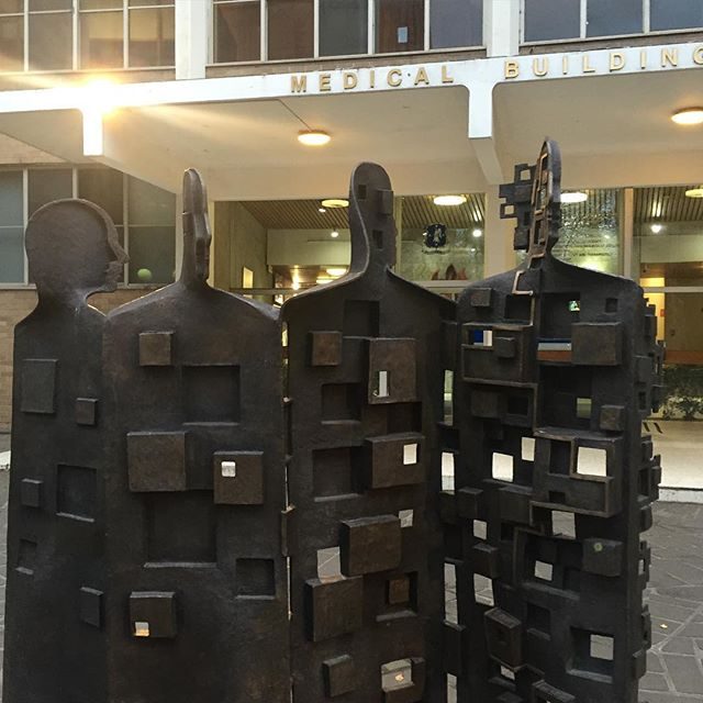
Medical building at Melbourne Uni
-
Honoured to be joining the super talented Joe McGill as a guest committer for WordPress 4.6.
-
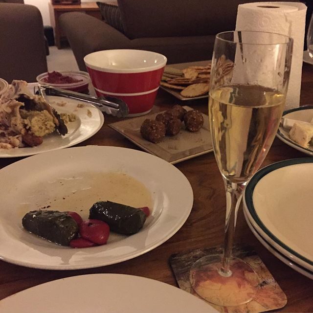
Pre #sbseurovision feast & champagne to celebrate.