The full WordCamp Europe schedule is out. It’s great to see so many Antipodeans speaking.
Archives: Notes
-
-
One of the most rewarding things when helping organise a meetup is seeing speakers go on to larger events.
-
There are people encouraging refugees to self harm.
-
Proudly misty-eyed, Prime Minister.
-

-
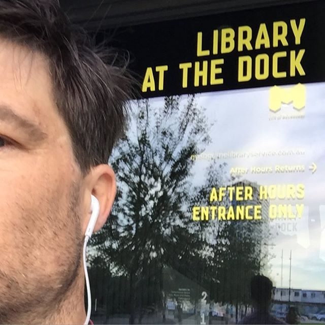
Last day at the dock for a while today.
-
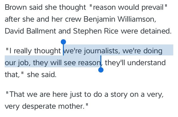
Channel 9’s claim they were only reporting conveniently ignores they paid the kidnappers.
-
A nice take on imposter syndrome by @ppk http://www.quirksmode.org/blog/archives/2016/04/impostor_syndro.html
-
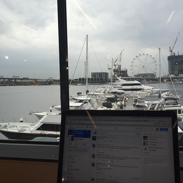
You know, even when it’s raining this thing looks pretty good.
-
Delighted to be speaking at #wceu in June. Looks like this year’s going to be amazing.
Tuesdays are meant to be all kinds of awesome. Say hello to the next group of #WCEU speakers https://t.co/9xcLtSOo6R pic.twitter.com/rIaRLK0CfQ
— WordCamp Europe (@WCEurope) April 19, 2016